CPI


Working Age Vs. Consumer Price Index
Working Age has effects on the P/E ratio as described here, but also has an effect on the inflation rate.
Yardeni describes this perfectly here. Younger people simply spend more than older people and contribute more to GDP and inflation. If we plot the percentage of younger people in society against the inflation rate we have a very nice correlation.
Yardeni describes this perfectly here. Younger people simply spend more than older people and contribute more to GDP and inflation. If we plot the percentage of younger people in society against the inflation rate we have a very nice correlation.
This explains why Japan had a deflationary environment for so many years due to its low fertility rates. Knowing this, we now can expect inflation to go back up in China because they just announced an end to the one child policy this month in 2015. But this inflation will only come when these babies start to work.
Bonus chart:
Retail Sales Vs. Consumer Price Index
The retail sales report is a monthly economic indicator compiled and released by the Census Bureau and the Department of Commerce. It gives a monthly aggregated measure of sales of retail goods. So basically it gives the sales figure of what people bought the previous month.
If retail sales go up, it means people either bought more things, or prices went up for their goods or a combination of both. But I think retail sales are a good indicator of inflation.
The chart below clearly illustrates that retail sales are a leading indicator for the consumer price index, so everyone should monitor the retail sales numbers to get an idea on inflation.
Inflation expectation is rising
The latest CPI numbers are out and we see that yoy inflation rates are now at 2%. I expect inflation to go higher in the future, because I see that the capacity utilization rate for May 2014 has been up to 79.1 for the total industry.
For mining, the capacity utilization rate even goes to 91, the highest in decades. I guess the mining industry is working at near full capacity and that’s good for commodities to go higher.

Remember, when the CPI goes up and bond yields drop, gold goes higher. And that’s exactly what is happening now. Bond yields are lower and CPI is higher.
Capacity Utilization Points to Higher Inflation
Capacity utilization rate is a leading indicator for inflation. And the latest number is at 79.2, a new record high since the bottom of the crisis. If history is an indicator, we should see huge inflation rates in a year from now.
The chart below points to a year over year CPI rate of 5% in the coming future. And we’re already half to that number as the latest consumer prices pointed to a 0.2% increase in prices in the month of March, or a 2.4% inflation rate per annum.
You can be sure that inflation is coming and you should prepare for that accordingly.
Federal Funds Rate Vs. Consumer Price Index
From the first FOMC meeting lead by Janet Yellen, we noticed one important statement:

“The Fed Funds Rate will be kept low when inflation stays at this low level.”
Thus, we chart the Fed Funds Rate against the CPI and get this result.
There is a strong correlation between the Fed Funds Rate and the inflation rate (CPI).
So we expect that an increase in interest rates will only happen when inflation starts to rise. The unemployment rate is not on the radar anymore.
Notice that historically the Fed Funds Rate is higher than the inflation rate (positive real interest rate (above 0%)), but today the Fed Funds Rate is lower than the inflation rate (negative real interest rate (below 0%))
M1 and CPI are Negatively Correlated
A recent article by Henry Bonner of Sprott Global Resource Investment caught my attention. In that article he mentioned Mishka Vom Dorp’s comments about money supply and inflation. One quote from Mishka is the following:
“First and foremost, an increase in the money supply does not directly result in inflation. In fact, the correlation between increases in M1 – money held by the general public – and inflation becomes apparent only when the timeframe is extended beyond a five year period. Over this longer time frame, the correlation becomes almost perfect.”
So I wanted to see for myself if what he says is true. I plotted the change in M1 against the change in CPI.
To my surprise the correlation is completely the opposite. We have a negative correlation here. Whenever the M1 growth increases (blue chart goes up), the CPI growth actually decreases (red chart goes down). The reason for this is probably that deflation is counteracted by the Federal Reserve by money printing and this causes M1 to increase during deflation.

What this means is that inflation will come when the money supply growth actually contracts. We’re in that period since 2012. So why is the red chart down since 2012? It’s because inflation has been visible in stocks, but stocks are not included in the CPI. But I believe we will see a flow from stocks to the consumer in 2014. Everything will normalize again to validate this (negative) correlation.
What Mishka says is true, there is indeed a delay between M1 and the CPI. By monitoring the change in M1, we can accurately predict the CPI. This is a very powerful tool indeed as this is a leading indicator. And as this correlation suggests, you should buy gold when the CPI goes up.
For the entire article, see below:
By Henry Bonner (hbonner@sprottglobal.com)
During a historic boom in equities, gold and gold equities have sunk to new lows with the GDX returning negative 55% over the past year. Why have gold and other precious metals fared poorly while other equities, such as those composing the S&P 500, have seen average annual returns of nearly 30%?
Mishka Vom Dorp, who joined Sprott Global Resource Investments Ltd. in 2008, explained why he believes precious metals have sunk – and where they are headed next.
“With government debt, unfunded liabilities and the money supply reaching all-time highs, surely the gold price should be increasing as well?
“The answer is, I believe, that in the short term, gold has not yet had time to react fundamentally. Whether you follow the official government CPI figures or alternative methods of computing inflation, we have yet to see the double digit inflation figures of the 70’s. There are two explanations that I believe are responsible for the lack of inflation that we see now but that we might see in the future.
“First and foremost, an increase in the money supply does not directly result in inflation. In fact, the correlation between increases in M1 – money held by the general public – and inflation becomes apparent only when the timeframe is extended beyond a five year period. Over this longer time frame, the correlation becomes almost perfect.1
“Secondly, two thirds of the freshly printed greenbacks have not been released into circulation and are being held directly at the Fed in what are called ‘excess reserves.’2
“The Fed has, so far, incentivized banks to keep cash there instead of lending it out by paying interest on the reserves. Remember that the amount of un-lent capital held at the Fed is increasing on a year-to-year basis and rising interest rates would cause those reserves to snowball. The Fed will eventually have to cut interest payments on excess reserves, thus releasing a large amount of capital into the financial system, leading to inflation if not enough GDP growth is there to accommodate the influx of new dollars.”
So rising interest rates could bring current levels of excess reserves down and boost inflation if the economy fails to deliver sufficient growth. Inflation may therefore rear its ugly head after all… As Mishka concludes, now is not the time to dump gold and precious metals equities.
“With a dwindling supply of juniors, continuing write-downs on assets by majors, and a continuing of easy money policies, I believe we are close to finding the elusive bottom to this bear market.
“The longer the bear market, the stronger the bull. Investments in exploration and development of mineral deposits have fallen massively over the past three years. Mineral exploration is an extremely capital intensive business requiring billions of dollars in investments to find and develop large scale mines. With majors cutting their budgets across the board to bring down costs demanded by investors, it has been left to the juniors to ensure discoveries are made to meet current and future demand.
“Now that only a handful of competing resource investors are still around, we will have the ability to research, finance and invest in what we believe are the best companies without the need compete with an eager market.
“I would be devastated to have sat through this bear market this far with you only to have missed out when the picture finally shifted in our favor.”
Art Prices Predict CPI
From Kingworldnews:
According to Austrian Business Cycle Theory the prices of capital goods (= asset price inflation) increase first in the course of an inflationary process, while consumer price inflation (= rising consumer prices) only ensues later. The asset price inflation that is currently in train can be identified by a multitude of symptoms. Prices for antiques, expensive wines, vintage cars, but also real estate and especially stocks recently increased strongly.
This quote is actually a very interesting one, because it can be added to our collection of correlations. Whenever you look at the trend in art, stocks, real estate (capital goods), you can predict the CPI. Because capital goods asset prices will always increase first and when this money flows into the economy, the CPI will increase afterwards. Note that art, stocks are not included in the CPI, that’s why the CPI doesn’t show inflation yet.
Peter Schiff has explained this too in one of his radio shows. He says that the QE that we see now is boosting asset prices. Eventually all these earnings will flow to the consumer and that’s when we will see the CPI go up.
So in the graphs below, you will first see the red (art), yellow (stocks) and blue line (real estate) go up and afterwards the CPI will increase. That’s why I believe that stocks can go down, while the CPI keeps going up, because we have this delay.


Consumer Price Index: The effect of a rise in oil prices
With crude oil going back over $106/barrel (which is a 20% increase from $90/barrel), let’s see how the CPI would do.
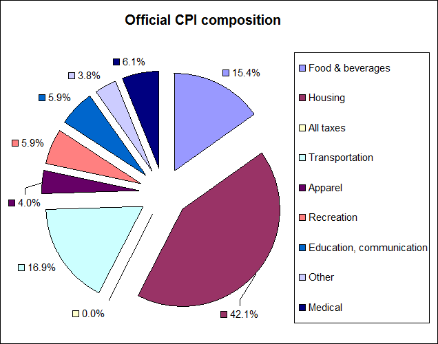
As you know, the consumer price index consists mostly of housing (42%), then second comes transportation (17%) and last comes food (15%).
The crude oil is part of the transportation segment. One third of the transportation segment is motor fuel or 5% of the CPI.
So if oil prices go up 20%, the CPI will only go up 20% x 5% = 1%.
More importantly, housing determines a major part of the CPI. Half of the housing segment consists of Owners’ equivalent rent of residences which is basically the amount of rent you would pay for staying in the house. This depends on the housing prices. 10% of the housing segment is fuel and utilities. So if oil goes up 20%, the housing segment will go up 10% x 20% = 2%. And the CPI would go up 2% x 40% = 1%.
 |
| CPI |
So basically, if oil prices go up 20%, the CPI at least goes up 2% from the fuel in the housing and transportation segments (if all else stays equal). The other segments will of course be influenced too by rising oil prices, but to a lesser extent.
So that’s the significance of the oil price on the CPI.
Initial Jobless Claims starting to rise, S&P in for a correction
This week’s initial jobless claims were rising again as reported by Zero Hedge and based on the obvious correlation between the S&P and initial jobless claims here, I expect that the S&P will come down eventually.

On top of that, the capacity utilization for the previous month was edging down (blue chart going up), which confirms that the unemployment rate will start going upwards (red chart going up).
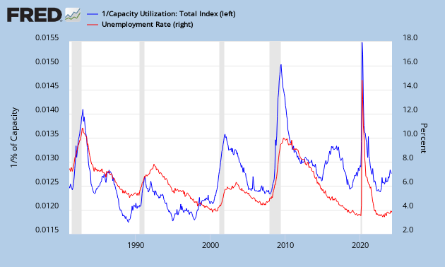
While deflation sets in with a lower CPI (red chart going down).

