A Zerohedge article describes how job hires are correlated to the change in payrolls.
 |
| A discrepancy occurred from 2010 onwards as layoffs went down. |
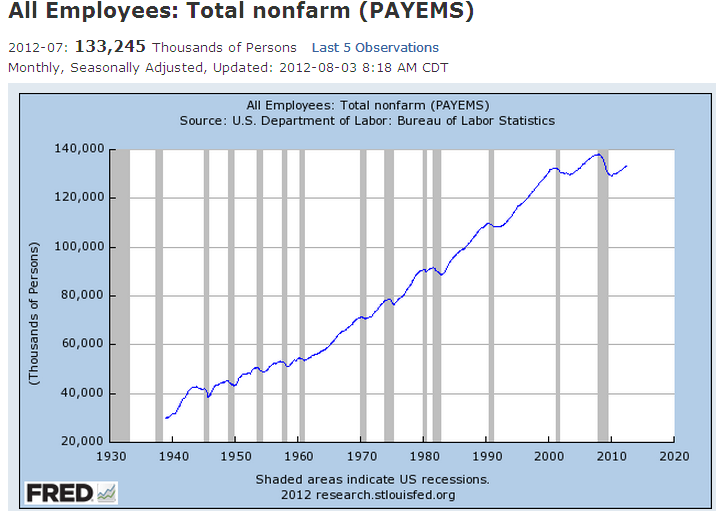
1) The nonfarm payroll number is a measure of the number of U.S. workers in the economy that excludes proprietors, private household employees, unpaid volunteers, farm employees, and the unincorporated self-employed.
2) The job hire number is the amount of people that are actually getting a job per month. So if job hires increase, the amount of workers in the economy increase, if all else stays equal.
But the amount of workers in the economy also depends on the amount of layoffs.
=> Change in amount of workers in the economy (blue chart) = job hires (red chart) – layoffs
A discrepancy occurred from 2010 onwards as layoffs went down. So the increase in payrolls was not due to increased hiring, but due to a decrease in layoffs.
Conclusion: The importance of monitoring this chart is to know how much of the increase in payrolls is due to hiring. Because hiring is the real driver in the jobs market.