World Gold Council: Gold Supply and Demand

I took all the quarterly numbers from the World Gold Council annual reports on supply and demand, and put it in one chart. Can be useful for the future.

First of all, the massive 2000 tonne/annum demand from China that started in 2008 and blew off in 2013 doesn’t seem to be incorporated in this chart.

Second, we see that supply has peaked in 2012 and I see this supply going down in 2015. Demand has started to pick up since September 2013.

Third, we see a massive spike in gold demand in 2008 when the crisis started, will we see this again in 2015?

An Analysis on the All-in Sustaining Cash Costs of Gold Mines

In June 2013, the World Gold Council (WGC) published a guidance note on the all-in sustaining cash cost metric for gold mining companies. This way, investors can have a better evaluation on the real cost of mining gold. This metric adds additional costs which reflect the varying costs of producing gold over the life-cycle of a mine. To name a few: by-product cash costs, sustaining capital, corporate general and administrative expenses, and exploration costs. We calculate all-in sustaining costs as the sum of total cash costs (net of byproduct credits), sustaining capital expense, corporate, general and administrative expense (net of stock option expense) and exploration expense.

There is one flaw in this system though. These all-in costs only include additional all-in sustaining costs and do not include CAPEX for projects. If we would include these project costs, we would get an astounding $1784/ounce in 2012 for the bigger gold mining companies. Nevertheless, it’s a first step in the right direction.

It is interesting to analyze how the all-in sustaining cash costs have progressed in 2013 as compared to 2012. All-in cost data has been taken from a research report of Dundee Capital Markets for the 2012 estimate.

Chart 1: All-in costs gold miners 2012 (Dundee Securities)

We see here that many gold miners are producing just under the average gold price of $1600/ounce in 2012.

Now we fast-forward to 2013, take data from a recent Denver Gold luncheon for the 2013 AISC cost estimate.

Chart 2: AISC gold miners 2013 (Agnico Eagle)

Again we see that the all-in sustaining costs are hanging just below the current average gold price of $1300/ounce in 2013.

Now let’s compare these numbers year over year. Read on here.

Gold Supply and Demand Trends

The World Gold Council sent out another report for Q2 2013 here.

As expected, we saw large ETF outflows both from GLD and other ETF’s, which led to a decrease in investment demand (Chart 9). But the decrease in investment demand was countered by an increase in jewelry demand, especially from India and China. We now see that the ETF’s have finally stopped selling their gold into the market, so I expect that Q3 2013 will be more positive on the demand side.

On Chart 2 you can see that ETF’s have large outflows, but this is countered by growing physical demand.
On the supply side we see that mining supply has increased, but recycling of gold has decreased, due to the fact that people won’t sell their gold at these low prices. I expect mining supply to come down significantly in the next quarter due to the fact that mines have been shut down, workers have been laid off, funding was subdued…

So the overall picture is that the gold price is especially dependent on the demand side, as the supply side is pretty flat. Watch out for the ETF’s and the physical demand for bars and coins. Once the ETF’s are done selling, we will see higher gold prices.

The Great Disconnect in the Paper and Physical Precious Metals Market

Over the last few months, precious metals investors have seen their net worth decline due to declining precious metals prices (GLD), (SLV). A lot of this decline in precious metals prices was due to a decrease in demand, which was the result of selling by hedge funds as the World Gold Council reported here.

First quarter gold demand of 963 tonnes was down 13% compared with Q1 2012 due to an outflow in the total gold ETF holdings of 177 tonnes. 2013 marks the first year in a decade where ETF’s are actually selling gold. While ETF holdings were reduced, this selling has been countered by an increase in physical demand for gold by China and India. Total demand in China rose 20% to 294 tonnes in Q1 2013 as compared to Q1 2012 (50 tonnes increase).

This huge increase in demand for physical gold can be witnessed on Chart 1, which gives the net imports of gold from Hong Kong to China.

While Chinese demand for gold was strong, Indian demand increased at an even higher pace. The Indian demand for gold increased 27% on the same quarter last year to 257 tonnes.

On the supply side we see a total increase of 1% in the first quarter of 2013 as compared to Q1 2012. Mine production increased 4% while recycling of gold decreased 4%.

(click to enlarge)

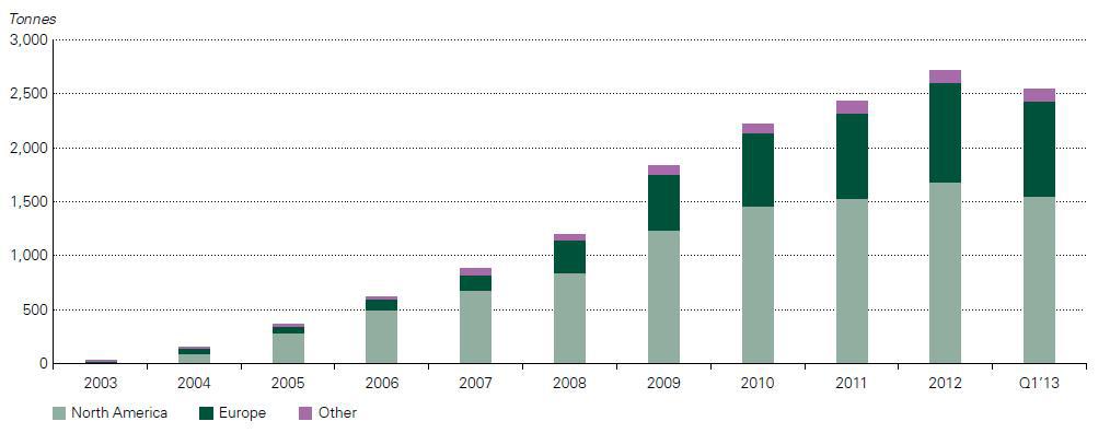
So, the reason for the decline in precious metals prices is evident from an increase in supply (mine production increased) and a decrease in demand for gold (ETF outflows) (Chart 2). But there is an important point I need to make here. While the supply side is pretty constant at 1% increase, the demand side is the critical indicator we need to look at with its 13% decline. The decline was a result of hedge funds converting their gold holdings into equities. The Dow Jones (DIA) hit an all time high last week, fueled by a bullish prospect in the equity market of Japan, which on itself was a result of the massive Japanese monetary stimulus announced in April 2013. Although investors are cheering the bull market in equities, the macroeconomic conditions keep worsening. A few examples were a deterioration in PMI, capacity utilization, ISM manufacturing, vehicle sales, ADP employment, initial claims, PPI, mortgage applications, wages.

To see what this means for gold, read on here.