GDP Vs. Trade Balance

The trade balance numbers are given monthly, so they can be a good indication on how the GDP numbers will pan out as they are quarterly numbers.

We can predict the GDP numbers by looking at the trade balance numbers. Whenever the trade balance goes into surplus, the GDP growth actually accelerates. This is because people will import more to consume more. A big part of GDP is mostly based on consumption.
For more info on this, go here.

Predicting GDP with the Trade Deficit

We recently got the trade deficit numbers and it widened the last month. Peter Schiff notices that GDP is influenced by the trade surplus/deficit. He says that GDP will drop when the trade deficit widens. This is very useful because trade deficit numbers are monthly, while GDP numbers are quarterly measures. But I think this theory is faulty, because there are other things to consider.

So I looked up the definition of GDP:

GDP (Y) is the sum of consumption (C), investment (I), government spending (G) and net exports (X – M).

Y = C + I + G + (X − M)

Here is a description of each GDP component:

  • C (consumption) is normally the largest GDP component in the economy, consisting of private (household final consumption expenditure) in the economy. These personal expenditures fall under one of the following categories: durable goods, non-durable goods, and services. Examples include food, rent, jewelry, gasoline, and medical expenses but does not include the purchase of new housing. 
  • I (investment) includes, for instance, business investment in equipment, but does not include exchanges of existing assets. Examples include construction of a new mine, purchase of software, or purchase of machinery and equipment for a factory. Spending by households (not government) on new houses is also included in investment. In contrast to its colloquial meaning, “investment” in GDP does not mean purchases of financial products. Buying financial products is classed as ‘saving‘, as opposed to investment. This avoids double-counting: if one buys shares in a company, and the company uses the money received to buy plant, equipment, etc., the amount will be counted toward GDP when the company spends the money on those things; to also count it when one gives it to the company would be to count two times an amount that only corresponds to one group of products. Buying bonds or stocks is a swapping of deeds, a transfer of claims on future production, not directly an expenditure on products. 
  • G (government spending) is the sum of government expenditures on final goods and services. It includes salaries of public servants, purchases of weapons for the military and any investment expenditure by a government. It does not include any transfer payments, such as social security or unemployment benefits
  • X (exports) represents gross exports. GDP captures the amount a country produces, including goods and services produced for other nations’ consumption, therefore exports are added. 
  • M (imports) represents gross imports. Imports are subtracted since imported goods will be included in the terms G, I, or C, and must be deducted to avoid counting foreignsupply as domestic.

    So this basically means that if we have a bigger trade deficit (or X-M becomes smaller), then the GDP will drop. Correct.

    The question is, by how much? Looks like the X-M part isn’t that big (only 3%). But it does give an indication…

    So I don’t expect the trade deficit to be an accurate measure to predict GDP. What is more important are the durable goods and we know about the durable goods orders metric. Let’s look at the durable goods orders.

    Something amazing can be found between durable goods and the trade deficit.
    Whenever the trade deficit widens (red chart goes down), then the durable goods orders go up (blue chart goes up). This means that GDP could increase, if the trade deficit widens. Very weird right, but it’s reality. Because Americans buy things via imports and thereby the trade deficit gets worse.

    Conclusion, if the trade deficit widens, GDP growth will probably accelerate and the stock market will go up (not down). So you can predict the GDP with the trade deficit.

    Silver goes into deficit in 2013

    David Morgan forecasted a silver deficit in 2014, well we don’t even have to wait for the 2014 numbers, because 2013 already had a silver deficit.
    We have the new numbers hot off the press. 
    As you can see below, total supply dropped from 1005.3 to 978.1 million ounces. While demand has gone up from 954.4 to 1081.1 million ounces. You know what that means. When something goes into deficit, the price has to go up to balance supply and demand.
    Don’t forget that silver supply from mines has gone up in 2013, but is expected to go down from 2017 onwards.
     
    Silver Supply and Demand

    Let’s calculate the upside: price rise = (100/(1-Demand decrease)) – 100
     
     = (100/(1- ((1081.1-978.1)/1081.1))) – 100 = 11% price rise
    Not too shabby, but who knows how big the deficit will become in 2014…

    Tax Revenue To Come Down, U.S. Dollar To Weaken Further

    One of the main reasons why I think that tax revenues will not increase anymore is because the people don’t have any savings left at this stage.

    There is a correlation between what the government receives in taxes (blue chart), and the savings rate (red chart). When the savings rate makes a bottom, this coincides with a top in tax revenue.

    The savings rate just dropped to 4.2% from 4.5% and this will eliminate all hope that tax revenue will continue its increase. What this also means is that the deficit will likely continue to increase.

    We already see this happening in the budget deficit, which has increased again (yellow chart). An increased deficit will weaken the U.S. dollar and put pressure on U.S. bonds (higher yields). With this information, you can prepare accordingly.

    Correlation: Trade Balance Vs. Currency Strength

    As predicted in this article, the improving trade deficit numbers in the U.S. weren’t going to last. This brings me to a new correlation.

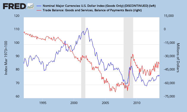
    The following chart gives the monthly U.S. trade deficit (red chart) Vs. the U.S. dollar index (blue chart). If the trade deficit widens (red chart goes down), the U.S. dollar index will drop (blue chart goes down).

    As you know, a trade deficit means that imports exceed exports. Americans buy more stuff from foreigners and in exchange they give money to these foreigners. This money needs to be in the currency of the foreigners. Let’s say an American buys a Chinese TV. He will have to pay yuan to the Chinese merchant. To do this, he will convert U.S. dollars to yuan. This will lower the value of the U.S. dollar.

    The other way round is also true. China has a trade surplus and will sell its goods to America in exchange for U.S. dollars. These U.S. dollars will be converted to yuan, otherwise the Chinese merchant can’t do much with the U.S. dollars in his country. This will increase the value of the yuan.

    Of course, there is a lag between trade and currency conversion. This lag is approximately 1 year. As a consequence, the trade balance is a leading indicator for the strength of a currency. The higher the U.S. trade deficit, the more probable that the U.S. dollar will go down in value.

    Recently, the trade deficit has improved a lot since 2010, the U.S. dollar strengthened with it. But I believe this improving trade balance has started to roll over.

    To show that this correlation is valid, I will give another example: Japan. Macro Man’s blog indicates that the Japanese yen is about to collapse if we look at their trade deficit numbers. As the blue chart goes down, the yen should weaken considerably.

    If you know that the trade deficit is a leading indicator for currency weakness, you can predict the collapse of the U.S. dollar by just looking at the trade deficit trend. You can position yourself for this collapse in the U.S. dollar by buying precious metals and commodities.

    The Declining Trade Deficit: Not As Rosy As You Would Think

    The trade deficit numbers are out for June 2013 and have been very positive. Due to an oil boom, the trade deficit shrank 22% from around $44 billion in January 2013 to $34 billion in June 2013.

    As you can see on Chart 1, the decrease in deficit was due to an increase in exports (red chart) and a decrease in imports (blue chart). This looks very promising, but I want to show that not all is well if you look into the details.

    Chart 1: Import Vs. Export

    Let’s look deeper into these import and export numbers. Chart 2 gives the breakdown of the export numbers. The largest segments are “machinery and transport equipment”, “chemicals and related products” “mineral fuels and lubricants” and “re-exports”.

    Chart 2: Exports January 2013

    Chart 3 gives the breakdown of the import numbers. The largest segments are ‘machinery and transport equipment”, “mineral fuels and lubricants”, “miscellaneous manufactured articles”.

    Chart 3: Imports January 2013

    From these numbers we can deduct that the oil industry is indeed a very important segment that will influence the import and export numbers.

    If we then further look at how these numbers evolve in time from January 2013 till June 2013 we have charts 4 and 5.

    Chart 4: Exports (billion USD)
    Chart 5: Imports (billion USD)

    When analyzing the trends on charts 4 and 5, there is one segment that is worth noting. We see that exports of petroleum products (which are incorporated in the segment “mineral fuels and lubricants”) have been going up, while imports of the same have been going down. The reason for this can be found in the divergence of West Texas Intermediate (WTI) crude oil and Brent crude oil.

    To continue reading this analysis: go here.