Real Estate Prices in Eurozone Declining

Eurostat just released an update on the house prices in the Euro Area. I am actively following this to follow up on the Belgium housing market, which I think is in a bubble.

The latest release on housing prices can be found in this report.

The trend is obviously down since the crisis of 2008. So it is still not a good time to buy a house. Renting is a lot better. As a matter of fact, I just had a walk around my area with the dogs and I’ve seen so many homes for sale it’s not funny anymore. Belgium is the least affordable country in the Eurozone to buy a house.

Looks like Belgium is down 1.1% quarter over quarter and I expect it will get worse.

Art Prices Predict CPI

From Kingworldnews:

According to Austrian Business Cycle Theory the prices of capital goods (= asset price inflation) increase first in the course of an inflationary process, while consumer price inflation (= rising consumer prices) only ensues later. The asset price inflation that is currently in train can be identified by a multitude of symptoms. Prices for antiques, expensive wines, vintage cars, but also real estate and especially stocks recently increased strongly.

This quote is actually a very interesting one, because it can be added to our collection of correlations. Whenever you look at the trend in art, stocks, real estate (capital goods), you can predict the CPI. Because capital goods asset prices will always increase first and when this money flows into the economy, the CPI will increase afterwards. Note that art, stocks are not included in the CPI, that’s why the CPI doesn’t show inflation yet.
Peter Schiff has explained this too in one of his radio shows. He says that the QE that we see now is boosting asset prices. Eventually all these earnings will flow to the consumer and that’s when we will see the CPI go up.
So in the graphs below, you will first see the red (art), yellow (stocks) and blue line (real estate) go up and afterwards the CPI will increase. That’s why I believe that stocks can go down, while the CPI keeps going up, because we have this delay.

Building Permits Vs. Housing Market

The authorization of building permits is a leading indicator for the housing market. As you can see on this chart, the new private housing units authorized by building permits move first, while the house price index moves several months later. 
This way, you can predict the direction of the real estate market. 
On June 2013, the direction of the housing market is clearly upwards.

The Housing Bubble is Deflating

With the recent surge in the mortgage yields, let’s see how the housing market is doing. The two key metrics to look at are mortgage rates and household income. Let’s analyze the mortgage rates first.

Historically, there is a high correlation between 30 year U.S. treasuries and 30 year mortgage rates (Chart 1). The chart shows that the 30 year treasury yield has spiked upwards starting in 2013, so I expect that the 30 year mortgage rates will spike upwards too. 30 year mortgage rates have already gone up from 3% to 4.9%, which had negative consequences for the real estate market, which is not priced in yet in the housing index.

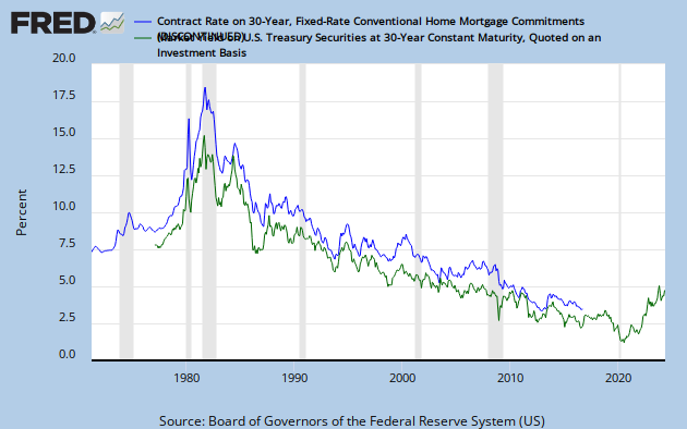
Chart 1: Correlation between 30 year treasury yield and 30 year mortgage yield

As Zero Hedge reports, the affordability of housing is declining rapidly with rising mortgage yields. Every percentage increase in yields on 30 year mortgages will result in a 10% decline in affordability as the chart shows. If yields continue to go up to 6%, affordability would have declined about 40% since 2013.

Chart 2: House Purchasing Power

The question is, will mortgage rates go up further? And what about the savings rate of the average citizen?

The answer is that real estate should be sold out of. Kyle Bass for example sold out of three of his real estate holdings: Newcastle Investment Corp (NCT), Hyatt Hotels Corporation (H) and Realogy Holdings Corp. (RLG ) – Real Estate Services.

=> Read it here.

Belgium housing bubble

The Economist has a nice interactive tool to monitor the house prices from 1975 till 2012: http://www.economist.com/node/21009954
A few interesting observations can be made:
Belgium, where I’m living, is still in an upward trend in housing prices (Chart 1), while this can’t be sustainable if we look at house prices against average income (Chart 2). Historically housing prices can only go up when wages go up, because you can’t buy a house when you don’t earn enough money to buy it/pay it off. I am expecting a similar drop in housing prices in Belgium like what has happened in the US in 2008.
In the United States, we see the collapse starting in 2007 and bottoming out in 2009.
In Japan, we see that house prices are becoming really cheap for Japanese people to buy, which is actually a good thing.
In Hong Kong we also seem to have a housing bubble forming.
Chart 1: House prices in real terms
housing prices in real terms
Chart 2: House prices against average income

Housing prices real income