A Zerohedge article made me think about the unemployment rate. Apparently, year over year, the civilian population rose while the labor force declined. You might say: “What does this mean?”.
Let’s first look at this informative video from Salman Khan:
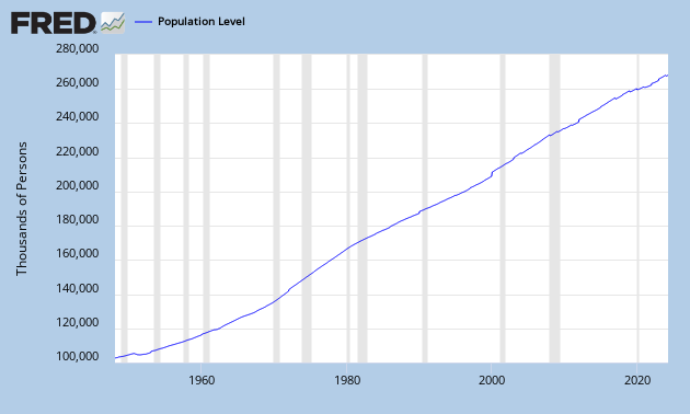
The yellow circle is the civilian population, people older than 16+ years, which can be found here:
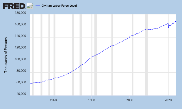
The green circle is the labor force, people who can work (employed + unemployed), which can be found here:
This conveniently gives me the labor participation rate by dividing them: (labor force/civilian population):

You can see that since 2000, the labor force participation rate has been declining and it is even declining faster after 2008. When the labor force participation rate declines, it becomes more and more difficult to support the economy as a smaller amount of people are working for an increasing population. This will lead to higher deficits, higher taxes, less savings etc… So the labor force participation rate is a great economic indicator to watch.
If you look at the figure below, we see that the yellow circle is growing faster than the green circle. And just recently, the green circle is even declining. While the yellow circle is growing. The yellow circle can only grow if young people (younger than 16 years) come into that yellow circle.

This also means that people are going out of the labor force (green circle) at a faster rate than young people are getting into the population (yellow circle). This is probably due to people who are discouraged or going on retirement.
As the unemployment rate actually declined to 7% now, these people leaving the labor force are mostly unemployed.
It all sounds very difficult, just let it sink in…

