Unemployment Rate Or Labor Force Participation Rate?

It is a real mystery how the European unemployment rate is 12%, while the U.S. unemployment rate is 6%, half of the European unemployment rate.

Obviously, the U.S. unemployment rate is not a good measure anymore for the state of the U.S. jobs market. Ever since the crisis started in 2009, the labor force participation rate has declined, so the jobs market was not improving. Recessions occur when the labor force participation rate drops, which means we’re in a recession since 2008 and have not gone out of this recession at all.

The U.S. unemployment rate should have soared to 10% at least, when counting all the people out of the labor force and this correlation proves it. Also, if next quarter has negative GDP as well, then we are officially in recession, which is very plausible, considering the decline in the labor force participation rate.


So which chart do you take, the red pill, or the blue pill? Contrary to the Matrix, the red pill is fantasy, while the blue pill is reality.

Labor Force Participation Rate Vs. Unemployment Rate

We all know the Unemployment Rate is rigged by the U.S. government. A much better indicator is the Labor Force Participation Rate. Historically, we see a negative correlation between the Labor Force Participation Rate and the Unemployment Rate.

Whenever the LFPR goes up (blue chart), we see a decline in the unemployment rate (red chart) and vice versa. This correlation has been true until 2008, where the U.S. government falsified the unemployment numbers and added hedonic adjustments. The red line should be going upwards since 2010 if we include discouraged workers, part-time workers, disabled workers, etc…

So, the key is to look at the labor force participation rate.

More info here. Labor force participation rate = green circle divided by yellow circle

Federal Funds Rate Vs. Unemployment

The unemployment rate is a key indicator for the Federal Reserve to set the Fed Funds rate. Whenever the unemployment rate goes up, the Federal Reserve will lower interest rates. 

This can be witnessed on Chart 1 which gives the Employment-Population Ratio Vs. the Fed Funds Rate.

Chart 1: Federal Funds Rate Vs. Employment-Population Ratio

Since the economic crisis of 2008, the employment-population ratio has never really recovered, that’s why there is very little incentive to ever increase interest rates.

Be advised that we need to look at the employment-population ratio rather than looking at the unemployment rate numbers, as these numbers are subjected to hedonic measures (discouraged workers, part-time workers), which started from 2008 onwards. To show this, look at Chart 2. You will see that since 2008, the correlation didn’t apply anymore.

Indeed, the U.S. government has been manipulating the unemployment numbers since 2008 (Chart 3).

Chart 3: Unemployment Rate

Single Family Housing Starts Vs. Unemployment Rate

One of the key metrics for the health in the housing market are the “privately owned housing starts”. “Housing starts” are an economic indicator that reflect the number of privately owned new houses (technically housing units) on which construction has been started in a given period. Usually, a decline in the “housing starts” leads to the start of a recession. 

The “housing starts” are a leading indicator for the unemployment rate. Both metrics are inversely correlated. When the “housing starts” drop, the unemployment rate will rise with a lag of about 1 to 2 years.

Because of the fact that the “housing starts” are a leading indicator, this is a very important metric to predict the unemployment rate. As a consequence, the “housing starts” are also a predictor of real GDP, capacity utilization, the stock market index and the consumer price index (CPI).

Unemployment Vs. Real GDP

The inverted Unemployment Rate is correlated to Real GDP and is also known as Okun’s Law named after Arthur Melvin Okun.

Zero Hedge featured Okun’s Law in this article.

Red curve: inverted yoy% change in unemployment rate
Blue curve: yoy% change in real GDP


Never in history has the unemployment rate been so artificially low (red graph artificially high) as today. The red curve has never been higher than the blue curve, which implies that the unemployment rate is much higher than officially reported.

We already know what the cause is: a lot of discouraged and part-time workers.

Moreover, the chart suggests that Real GDP (blue chart) is a leading indicator for the unemployment rate (inverted red chart).

As a final note, notice that we are talking about real GDP, which is inflation adjusted. This means that inflation negatively impacts real GDP and therefore inflation will in turn create higher unemployment rates at a constant GDP rate.

Average Hourly Earnings do not confirm Unemployment

As Zero Hedge reports here, the average hourly earnings were going down. That is not consistent with a lower unemployment rate.

Coincidentally, I have a chart on this correlation right here.

And it looks like this:

As you can see, how can the unemployment rate fall (yellow chart) if the average earnings go down (blue chart).

Reason: part time workers and people leaving the labor force.

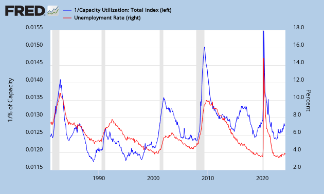
Capacity Utilization Rate Vs. Unemployment

This page is created to monitor the Unemployment Rate Vs. Capacity Utilization Rate.
Historically, when the capacity utilization rate goes up (blue chart goes down), the unemployment rate goes down (red chart).
We also know that a high capacity utilization rate points towards inflation. Inflation points towards a higher CPI and a higher CPI means higher average hourly wages. Higher wages point to lower unemployment. And the circle is round.